March 20, 2024
💎 Improvements
- Uppdate TextComponent ruby class and templates.
- Introduced some refactoring and simplified ruby class.
- Update files and components with the latest version of TextComponent
March 10, 2024
🌟 New Component and 💎 Improvements
- Create a new linkComponent.
- Uppdate TextComponent classes and attributes calls.
February 19, 2024
🌟 Dark mode using StimulusJS
Add new Dark mode using StimulusJS. Dark mode is a new feature that allows users to switch between light and dark themes. It is a great way to reduce eye strain in low light conditions. It also helps to save battery life on mobile devices.
💎 Improvements
- Apply the new SocialButtonComponent
- Update the Agency files.
February 10, 2024
💎 Improvements
- Refactor HeadlessButton component, use style in file instead of using StyleManager for now.
- Refactor Icon::Component logic.
- Refactor ProgressbarComponent logic and style.
- Fix minor issue with TabComponent related to initialization.
February 02, 2024
💎 Improvements
- Refactor Helper modules for better and efficient rendering components name.
- Create UtilitiesHelper for extra methods that were in ViewHelper.
- Rename social component for easy name call.
January 29, 2024
🌟 New TooltipComponentComponent
Add new TooltipComponent to add tooltip to any component. TooltipComponent enabes author to controle the tooltip content, position, style.
💎 Improvements
- Remove unused CSS class 'light' from style_manager file.
- Refactor tooltip styles and add position options.
- Update CSS styles for example section.
January 27, 2024
💎 Improvements
- Refactor profile component layout and add width option.
- Update styles for tabs and icon component.
- Add a new accordion Stimulus controller and update tabs controller.
- Remove unnecessary class from profile component
- Add more details, fixes and layout update for agency example section.
January 25, 2024
💎 Improvements
- Fix image source in card component and agency.
- Update Gemfile and css with rouge.
- Improve progressbar component style and layout.
- Add preview for progressbar component.
- Refactor color mappings in TextComponent.
- Refactor progressbar component styles and add label support.
- Add progress bar component previews. This commit adds new progress bar component previews for different styles, sizes, and colors. It also includes a preview with outside labels.
- Add StylesListHelper and ClassNameHelper to RapidRailsUI components and controllers.
January 22, 2024
🌟 New ProgressbarComponent
Add new ProgressbarComponent to add progress bar to Card component. While it works well with CardComponent, it can be used with other specific components. ProgressbarComponent enabes author to controle the progress bar height, position, direction, and 3 gradient colours, start, middle, and end.
💎 Improvements
- Remove unused CSS class 'light' from style_manager file.
- Add redcarpet and rouge gems for markdown rendering.
- Update agency content.
January 19, 2024
💎 Improvements
- Update avatar and alert styles.
- Update style and layout options in profile and text components.
- Update default colors for Icon::Component and HeadlessButton.
- Update card and text component styles to improve visual consistency and readability. Also, remove unnecessary color attribute from text component.
January 15, 2024
💎 Improvements
- Update avatar and alert styles for Home page.
- Add card style classes to the CardComponent
- Update font sizes and colors in text component.
- Update avatar and alert styles.
January 12, 2024
💎 Improvements
- Refactor SocialButtonComponent to include shape options
- Refactor alert component to include shape option.
- Add shape classes for all components.
- Refactor BasecampMessageComponent to include border shape.
- Refactor avatar component classes and shape mappings.
January 10, 2024
💎 Improvements
- Update icon colors in RapidRailsUI component
- Refactor style options in profile component
- Refactor color options in text component
January 07, 2024
💎 Improvements
- Update and add genearic style for background card other comonents StyleManager.
- Repalce info colour from sky to blue in StyleManager.
- Change color for tailwindcss config file.
- Remove alternative button from ButtonComponent.
- Remove Color attribute from TextComponent for clearity.
- Replace STYLE_DEFAULT from profile and use StyleManager.
- Rename basecampe logo.
January 05, 2024
💎 Improvements
- Simplify GradientBorderComponent attributes.
- Add more CardComponent examples to show how it can be used in different ways.
- Add more sixes for TextComponent body.
- Add another CardComponent for realestat listing.
- Remove extar styles from CardComponent url.
- Update hover style in StyleManager.
🐞 Fixes
- TextComponent: Fix title being nil when is it absent.
- SocialButtons: Fix buttons styles with style_classes.
January 04, 2024
🌟 New GradientBorderComponent
Add new GradientBorderComponent to add gradient border to Card component. While it works well with CardComponent, it can be used with other specific components. GradientBorderComponent enabes author to controle the border height, position, direction, and 3 gradient colours, start, middle, and end.
Adding the following card.with_border it creaets default values for each attribute, and it can be overriden by author.
💎 Improvements
- Simplified Card::HeaderComponent to have order set to default value. Author can addd order values such as '1, 3, 6, first or last'.
- Add borders to CardComponent.
January 02, 2024
🌟 New CardComponent Examples
Add new CardComponent examples to show how it can be used in different ways. CardComponent consisit of header, footer, and content regions. Adding other components to these regions will make it more flexible and useful.
💎 Improvements
- Add position order to card header. This is usefull with ImageComponent or BadgeComponent
- Change theme attr to style, and replace it's classes with StyleManager generic ones.
- Add style attr to CardComponent, and replace fixes styles to use StyleManager classes.
- CardComponent template show different layout for ImageComponent based on how it looks, flush or not.
- Add more attribute and tag options for TextComponent.
- Replace TextComponent color classes with StyleManager.
December 29, 2023
💎 Improvements
- Add genearic styles to style manager for card styles and text colour.
- Add more basic colours style matches TW colours.
- Update StyleManager style classes to focus on layout colour and not text.
- Add colours style to TW config for component with background such as cards, buttons, alerts.
- Add text colours classes for all components to refer to.
- Add alighnment round for card footer.
- Add order for header elemnts. This is helpfull with having 2 components inside header such as image and text components.
- Remove duplicate text style for header.
🐞 Fixes
- Style manager: Correct BaseClass dislay to flex.
- Style manager: Fix default text alignment to left.
December 24, 2023
💎 Improvements
- Add style for CardComponent's footer attribute text and content, and remove default values.
- Add ability for author to include button within CardComponent footer area.
- Refactor conditional showing for credits or content within CardComponent.
- Add ability for author to include images from ImageComponent.
- Add flush attribute when an image is present. This introduce `p-0` around the image only.
- Update ImageComponent preview examples.
- Move TabComponent preview to blocks folder.
🐞 Fixes
- Home: Fix errors and typo.
December 20, 2023
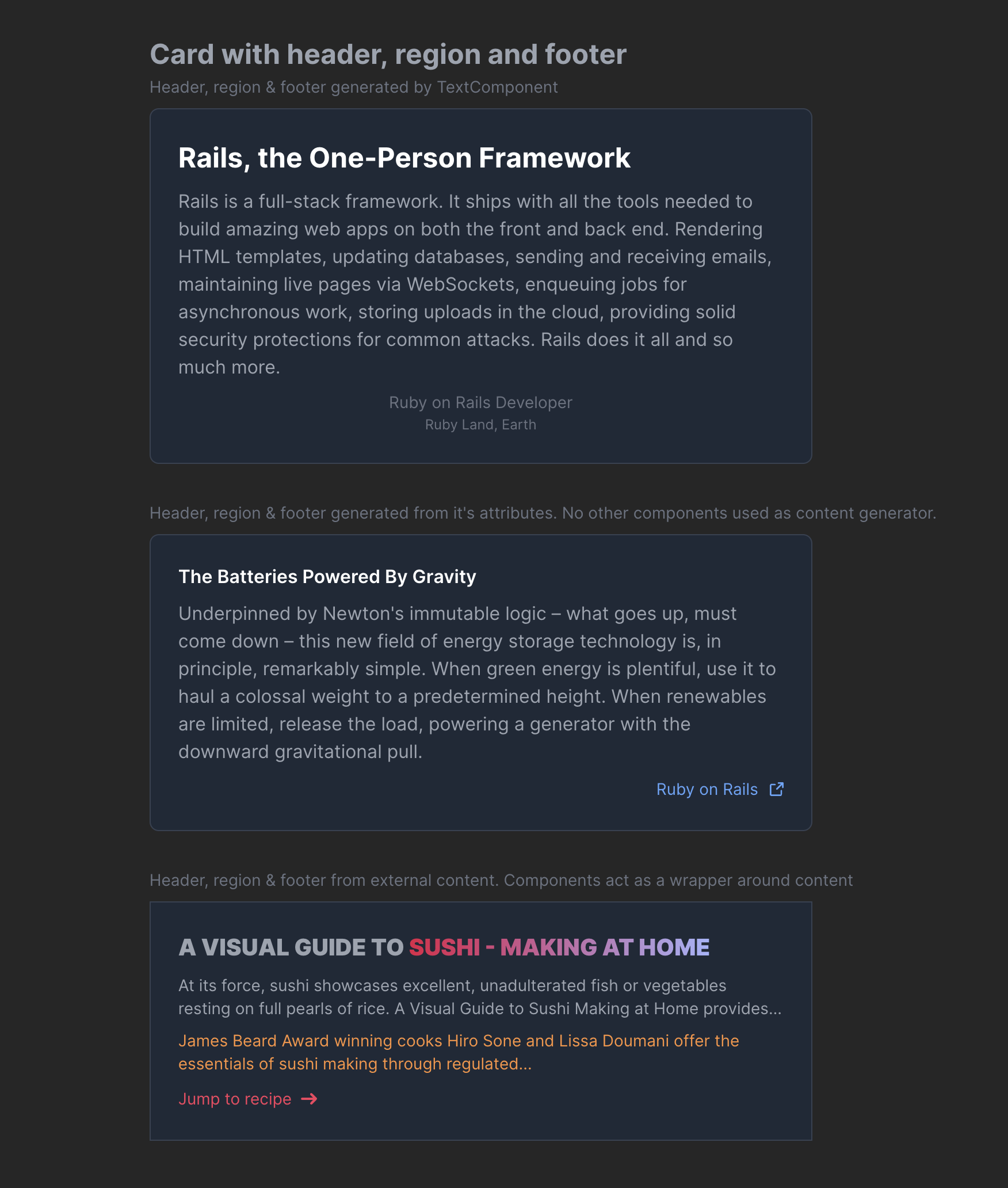
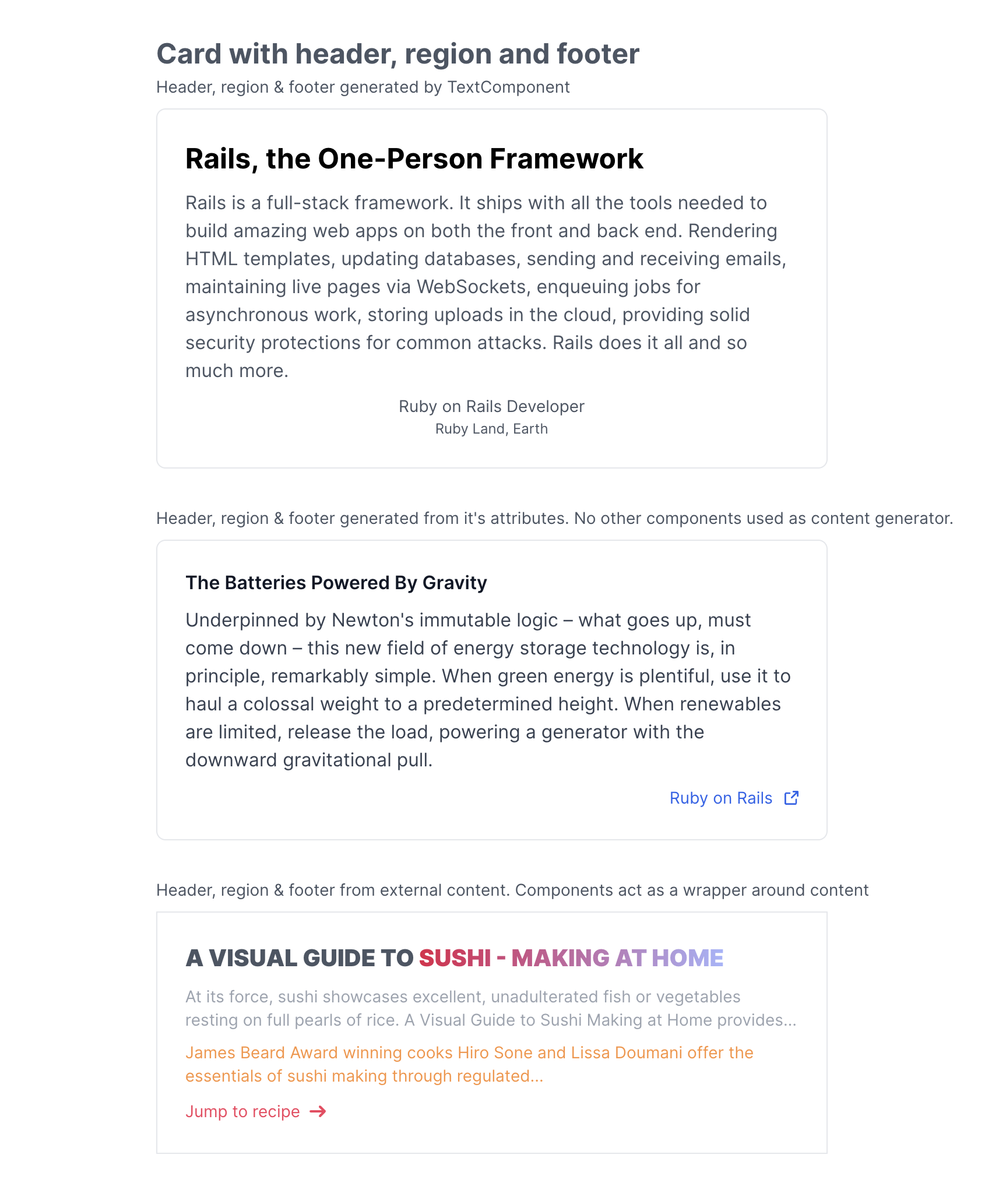
🌟 Card Component
The CardComponent is a versatile tool for organizing and presenting related information in an intuitive and engaging way. Its familiar design enhances user experience by making information easy to digest.
Offering a wide range of styles and functionalities, the CardComponent allows you to incorporate diverse content types. It supports embedding of other components, inclusion of partial views, or integration of custom HTML content blocks.
Whether it’s a basic card with a title and description, a more complex structure with headers, footers, and content regions, or an interactive card featuring lists and clickable elements, the CardComponent adapts to your needs.
Key Features of CardComponent:
- Enhanced accessibility across main components.
- Clickable functionality, activated by including a
urlattribute. - Change card widht based on your needs.
I will add other card varities in combination with other components "blocks" in the coming days.
You can check more about CardComponent in the documentation page.
Cards in dark mode
Cards in light mode
🐞 Fixes
- Profile: Apply conditional layout for profile component template.
- Home: Fix typo and reduce numbers of elements in hero section.
- Image: Fix image_classes to show correct css classes for images based on given values.
- Image: Remove size from group_it class as it duplicate it's value.
💎 Improvements
- Update docs for progress.
- Add New Year 30% promo code to RapidRailsUI home page.
- Add shape attribute to HeadlessButton class.
- Add width to ImageComponent to make it more flexible.
- Replace size with h_size attribute and suitable height values.
- Add truncate length attribute as authors can add character count (default value is 420).
- Add truncate CSS class based on "truncate-to-#{@length}" such as "truncate-to-140" as an indication of how many characters are showing. This can be styled later, if needed.
- Remove old unused comments, which could cause syntax issues.
- Add truncate to processed_content.
- Remove rounded css calss from button base class.
- Remove default width and height form SVG file.
December 9, 2023
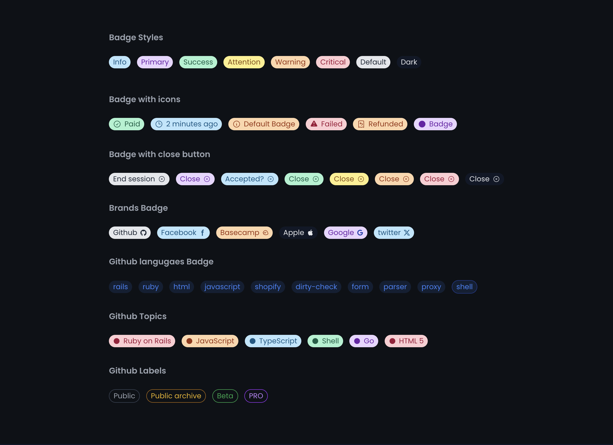
✨ New Badge component
The new Badge component offers variety of styles, functions for you to use in your application.
Badges can be used in different ways, such as:
- Badges with everyday use cases with matching colours
- Badges with different leading and trailing icons
- Badges with brands icons and styles
- Badges with different styles
- Custom badges for Github labels, languages and topics
The neat thing about Custome Components such as Badges Basecamp Messages, is I can generate them on demand or upon request from clients, beside current RapidRails Components
I will add other badges varities in combination with other components "blocks" in the coming days.
You can check more about Badge component in the documentation page.
Badges in dark mode
Badges in light mode
December 7, 2023
✨ New Avatar component
The new Avatar and logo component offers variety of styles and possibilities to use in your application.
When I start working on this component, I wanted to make it as flexible as possible, so you can use it in different ways with an easy to use API.
Avatar component offers the following features:
- Avatar with squared and rounded corners
- Clicable avatars with status indicator
- Stacked avatars when it is wrapped with specific css class
- Stacked avatars from both bottom and top
- Avatar with coloured rings around it
- Avatar with initials
- Avatar with default circled image
I will add other avatar varities in combination with other components in the coming days.
You can check more about Avatar component in the documentation page.
Avatars in dark mode
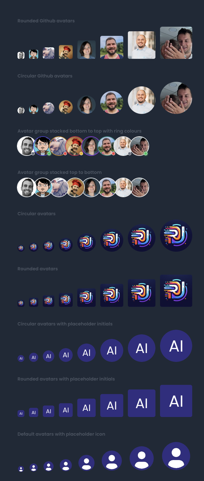
Avatars in light mode
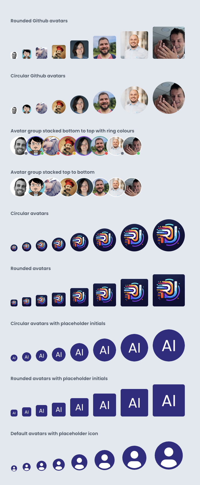
December 04, 2023
✨ New Icon component styles
This update introduce varieties of Icon::Component to add to your butons and other components.
New default icons where you can apply pre-defined styles to any icon within icon folder.
- The following line appds check mark icon with gray style.
rui_icon(name: "success", color: :default)
Novrmber 11, 2023
🚀 Pre-Launching RapidRails UI!
introduce RapidRails UI compoenents to the world and inroduce a pre-launch prices.
- First introduction about RapidRails UI Components on twitter, reaching out to everyone for feedback.
- Untill end of 2023 I'm planning to spread the word around, offer discounts, and start working on the first new package of components.